|
This is my revised magazine cover i produced. I made many changes to my cover because i felt my first cover did not go well with the rest of my magazine and that the colors did not go well together. The mast heads, coverlines and color palletes did not go well together and made the cover look messy. I changed my cover to have a more simplistic look, i changed the masthead name and font, the coverlines, the main image, and added a barcode. 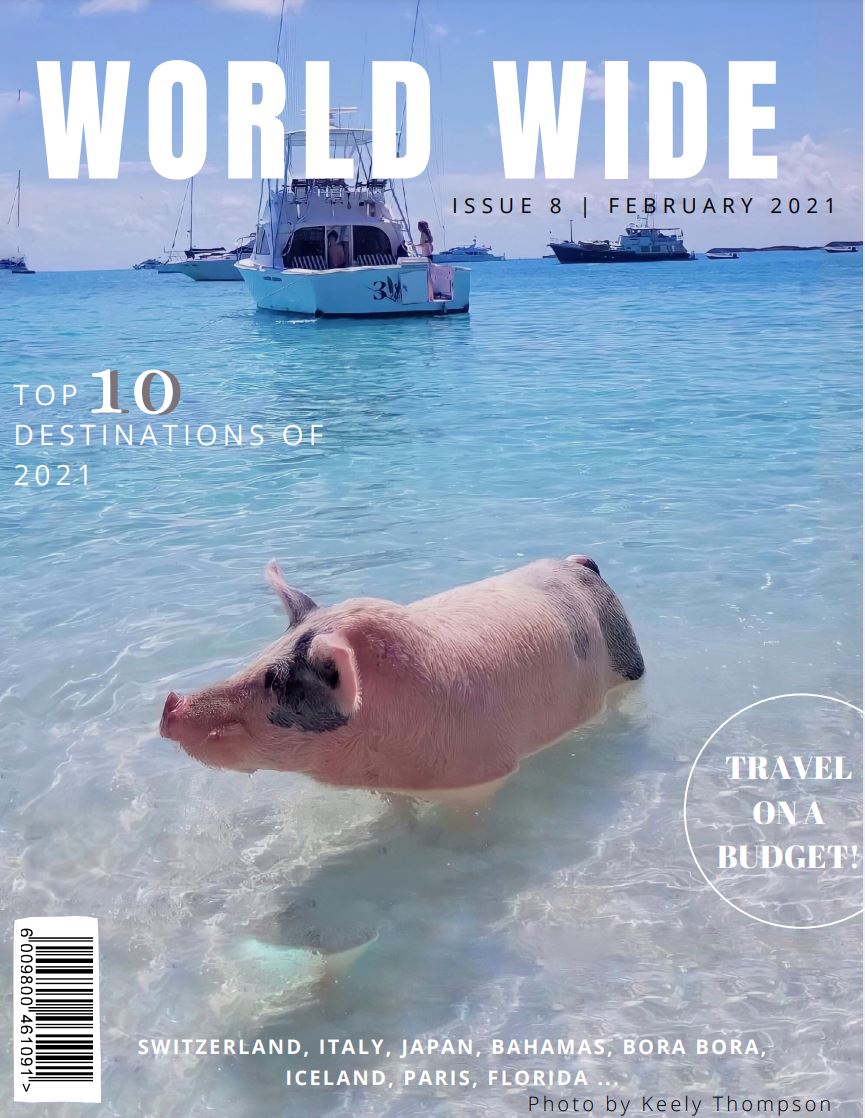 This "Alluring Escapes" is my original magazine cover. There were many issues with this original cover that needed to be changed. 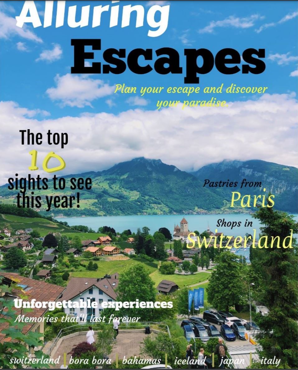
0 Comments
1. Who are you writing for?
The articles targeted audience is for travelers who want assistance in planning a trip and learning about different places that fit their liking. 2. What is important to your audience? It is important that my article clearly states the most important information about the country/city and that it states facts and gives details to give the reader s full description. 3. What news is currently trending? The most trending news is the pandemic and how traveling is very limited during this time. My article will clearly state what to do while remaining socially distanced and staying safe. 4. How are you going to start? I am going to begin by doing research on the city and then i will begin to plan the layout of the article. Where i would then find pictures that i took, that i feel would fill the layout the best. This is my first double page spread, it includes many photos and descriptions of places to visit in Paris. I used canva to produce this copy and the process was very smooth and the end result came out good with very little issues while creating the product. 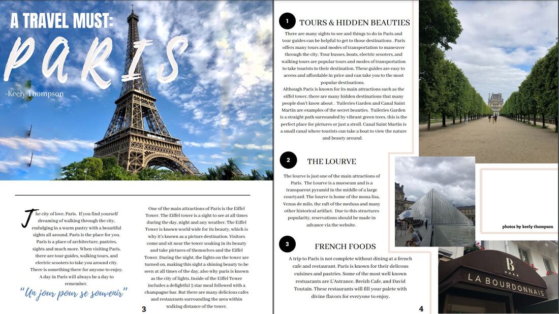 While creating my magazine cover, i used a variety of online tools to help create the best looking outcome. I used different online sites, software, and hardware devices to achieve my end result. I began using online sites such as, google, online articles, and magazines. These all helped me to better understand what a travel magazine may contain and what most potential buyers would find most appealing on a cover. Next, I used a laptop and Iphone as hardware. Using my iphone, I sent any pictures being used to my laptop. Where I then used my laptop to produce my magazine cover. Lastly, i used the software, indesign. Using Indesign I created my magazine cover, i imported my cover picture and added on my coverheads and title.
Throughout my magazine cover i expanded my knowledge in indesign and how to properly format a magazine cover. It was difficult learning to use indesign but once i figured it out it became much easier. Throughout formatting my cover, i encountered many mistakes and had many trials and errors. When placing my cover lines, i had to try many formats to come to my final conclusion. As well as, using different fonts and colors until i had found the one that fit the magazine the best. This process took a while because many of the colors i used didn’t match the cover and masthead.
My magazine cover is meant to engage will all audiences and the appeal to all audiences as well. The cover image is a bright, colorful image of Switzerland, this image was used so that it would leave the audiences to imagine all the possibilities of what to do there. Also, the coverlines engage with different audiences as well, such as travelers on budgets, those who want to explore a specific culture, and those who want to relax. The magazine would engage with audiences through social medias. Social medias such as, twitter, Facebook and Instagram will allow the magazine to engage with all different age groups and audiences. For example, Facebook has an older demographic and Instagram has a younger demographic. The older demographic on Facebook would most likely appeal to the coverlines stating escapes and relaxation, while the younger demographic would likely appeal to the “traveling on a budget” So, by using these two different platforms, we would we able to engage with different audiences.
My product could be distributed at many different locations and through online media. My magazine would best be distributed and sold at gift stores, airports and on social media. First, selling the magazine at a location such as an airport would be the best strategy to get buyers. Selling a traveling magazine at an airport is the best strategy because most of the potential buyers are in that area. Since those at the airport are travelers, they would be the group that would be most interested in the magazine. Next, distributing the magazine via social medias would be the most effective way to reach all audiences. Social media is used by all groups and demographics, making distribution to audiences extremely easy. First, the magazine would be promoted on apps such as Instagram then sold through links in the app. The way a product is distributed is especially important, so these steps are critical. 1. The editor of a film is the final gaurdian of the story.
2. The editor have the ability to move or impact the films perspective. Since the editor is in charge of the effects and how the camera stays on a person, that is what will effect the perspective of a charcater. 3. The editor is responsible for understanding the editing of software, the music and special effects. My magazine cover uses conventions to illustrate to the viewers what the magazine contains and to draw in the attention of people. One of the main conventions used was the cover image, this image is an extreme long shot of Spiez, Switzerland. This cover image would draw in the attention of many for its colors and overall beauty. Another convention used is cover lines, these were placed in different spots on the cover to give the viewer a sneak peak of the contents. For example, on the bottom of my cover I listed many places that would be talked about throughout the magazine and on the left I stated “top 10 places to travel this year”. To draw attention to those cover lines I used different fonts and colors. Lastly, another convention used was the masthead. The name of the title was “Alluring Escapes”, the name and fonts of the masthead need to stand out to draw the attention of potential buyers. So, the name Alluring Escapes was chosen to appeal to the largest audience and catch the eye of a viewer. But, I challenged the convention by using two different colors in the masthead, which is not very common in magazine covers.
My magazine represents some issues and social groups in the coverlines. One coverline states “how to travel on a budget”, this is meant to appeal to all but mainly for those who cant afford most vacations. It implys that it will give information on how to travel on a budget and give names of places that may be cheaper than most. Another way my magazine represents issues is through its variety of places to travel to. By listing the names of places that will be discussed, it will show the viewer how diverse the magazine is. Having places from all around the world with different cultures, foods and languages to appeal to all. These make the magazine more appealing to others and more likely to have other buyers. Throughout the advancements of technology, media has taken over. Every kind of media is owned by a company that has the rights to it. There are a some companies that own most forms of media that we know. But throughout the media ownerships it can form a lot of issues and effect the media around us. Also, since the spread of technology, medias have had to find new forms of funding, due to not selling physical copies.
There are different types of ownerships and convergence in media. Corporations may converge, one being vertical ownerships, when companies depend on one another. The other being horizontal ownership, when companies do not rely on one another but are owned by the same parent company. An example of horizontal ownership is 20th Century Fox which is owned by major film studios in Hollywood and is a subsidiary of Fox Entertainment which is owned by News Corporation. Due to advances in technology and media, companies have to find new forms of funding. Since not all companies rely on a bigger company and are self reliant, most have to find fundings. This most well known being advertisements. These advertisements most likely are funding but also supporting the companies. There may be ads and a brief description of a product hidden in the production. There has been discussions on whether news or channels can be biased based on the ownership of a media outlet. No matter if its political or social, no media station tend to have to same results or ideas. The company owner can do so by hiring certain people, blocking some information from being posted or firing people. One example of the effect of ownerships is Fox News and CNN. Both of these media outlets are news outlets but both tend to be biased. Fox news leans more republican and CNN leans more democratic. Both news outlets rarely ever say the same things about an issue or topic. These different news outlets target and attract different audiences. In conclusion, media ownership causes a lot of problems for media, audiences and economically. Also, with the expansion of technology many medias and companies have had to make adaptions. Although, these companies goal is to distribute media, there is clearly much more to it then the people know. 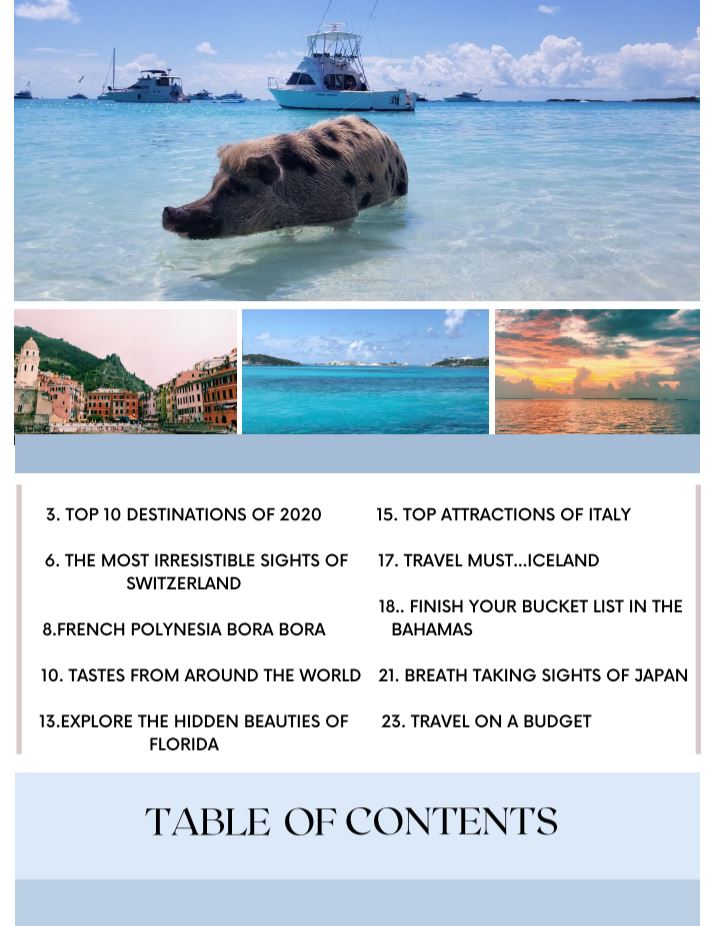 1. My product used colors that blend well together and different fonts to allow each to stand out. I used a bigger text for the "table of contents" so the readers eyes can easily view and know what they are looking at. My magazine would include many different places so there is something for everyone. It would also include "how to travel on a budget" this would help those who cant afford a vacation, it would include destinations for a cheap cost.
2.This would most likely draw in people who love to travel and with the pictures I chose, would draw in different groups of people. One image has a pig, which would attract more adventurous and animal loving people. Then there is also colorful old style buildings, for people who love to walk around and architect. Then the last two images show a more calming and relaxing places, this is portrayed from the calm waters and beautiful colors. This would be distributed through the internet and through stores. Online it would be easily accessible and in stores it would be easier to find and view. |
